Kever Sports a New User-Friendly Look
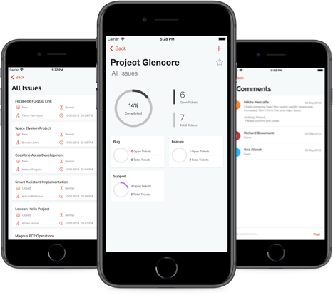
The Kever app for managing Redmine projects has been updated with a trendy user interface design. With the new branding and intuitive redesign, the app has received a total facelift.
Apart from the branding changes, the latest version ushers in a whole lot of user-friendly changes. The new app interface features an interactive card layout. Each project is now displayed as a card that opens up to show all of the project issues. A tab bar introduced in place of the old slide-out menu makes navigation smoother. More subtle yet significant changes have also been introduced as part of the UI redesign.

Highlights of the new version:
- New UI design with orange-white color scheme
- Card view to list projects
- Tab bar for easy navigation
- Number indication for filters applied
- Pie chart representations in dashboard
- Simple typographic logo
Kever is a handy productivity tool for project managers and team leads. The mobile client for Redmine makes it easy to manage multiple projects and track issues while on the move. Initially built and released by the QBurst team in 2014, the application underwent multiple revisions and feature enhancements over the years. The latest version was released on April 25, 2018 and is now available for free download from iTunes.
